
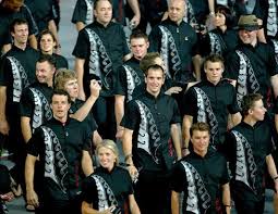
I would rate this as my favorite ( #1 ) because the detailing of the uniforms is not too detailed or too simple. I also like this one the best out of these 3 because the design on the uniform looks like a silver fern which is representing our country. I also like this one best because the choices of colors it really stands out and most countries dont have black and white.
This would be my second choice because I dont really like the designs on it because it's too simple and it wouldn't really pop out because most countries have something black on there uniform. The only thing I like about this is the layout of it but either than that In think they should add more stuff to the designs.

Out of all the 3 uniforms this would be the last one I would like because it looks old fashioned. I also dont like this one because it looks like these uniforms were from the olden day, plus it looks like nursing outfits ( no offense ).
For this activity there were 3 pictures of uniforms and we had to pick the one that was the best and the one that was alright and the one that was the worst. I really liked this activity because I got to see what the uniforms were like and I had to choose which one was the best and the one that wasn't.
1 comments:
I really enjoyed reading your explanations for your choices, Nesi. You put a lot of careful thought into your selection and I can clearly see why you made the decisions that you did. I also found it interesting to read that you thought that the 2012 Olympic uniform was 'old-fashioned.' That is the first time that I have come across anyone who has said that but I can completely see what you're saying. You have really helped me to see things differently. Thanks, Nesi!
Keep up the great work!
Cheers, Rachel
Post a Comment